ShopDreamUp AI ArtDreamUp
Deviation Actions


Description
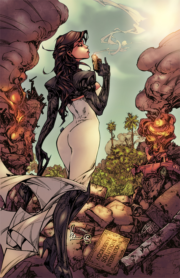
pencils by Kenneth Rocafort.
Inks by
colors by me.
comments and critique welcome.
Flats for this will be available soon at


If you like this you may also like:


*edit: some slight tweaks to the black levels.
Inks by
colors by me.
comments and critique welcome.
Flats for this will be available soon at
If you like this you may also like:
*edit: some slight tweaks to the black levels.
Image size
582x900px 629.02 KB
© 2010 - 2024 Eddy-Swan-Colors
Comments67
Join the community to add your comment. Already a deviant? Log In
Hi Eddie. Don't get me wrong, i usually like your coloring, but this time there are a bunch of things that come to my eyes and that I would work on (just my 2 cents).
-Vision: there is a lot of harmony in the picture and the color palette is really well chosen, nothing really wrong with it. Maybe the sky is a bit strange. I can see that you wanted to put some grey clouds but they're too blurry and undefined to me. Maybe no clouds, or white cloude, would have worked better?
-Originality: that's not your fault, you just followed the schemes you have probably seen around. But you could have done better for example setting the scene in the night with a purple\violet\red and cloudy sky, that would have been more original <img src="e.deviantart.net/emoticons/w/w…" width="15" height="15" alt="
-Technique: i'm not a big fan of lasso tool or gradient\soft shading. But i can recognize when it is well done. You can use well the technique but in my opinion there are a lot of details that you have lost. Her back, her ass, all the suit's folds, the smoke, the broken stones. They're plenty of details that are not evident in your coloring. You can tell that they exist because they're inked but they're not rendered as they should. This is my opinion but i am a big fan of details because if you don't pay attention to them, the whole picture tend to appear flat. Sure you don't have to go creazy with them, but in this picture there are too few. You have the tool to work on it you just need to spend more time on all the details. Another thing that i want to say is: try to make more hard edges in your work. Don't be afraid of them. Hard edges underline the forms, working too blurry of too soft make the picture (again) flat.
-Impact: The overall lighting and shading is right. Not too dark and not too bright. But the picture would have been more strong if you exalted a bit the explosions\fire in the picture. There should be some reflected red\orange\yellowish rimlights on the character and on the objects. The scene would have been more consistent because there is some fire in it. It's like the fire is there but it doesn't act like fire.
Ok i hope to have been clear and not have offended you with my detailed critique. But i think that a critique is constructive and useful only if it's complete. I hope you will appreciate it, and feel free to "destroy" some of my works, we all need to get better, and that why we're here.
Good luck with all your projects!
Regards,
Ace <img src="e.deviantart.net/emoticons/s/s…" width="15" height="15" alt="